.png)
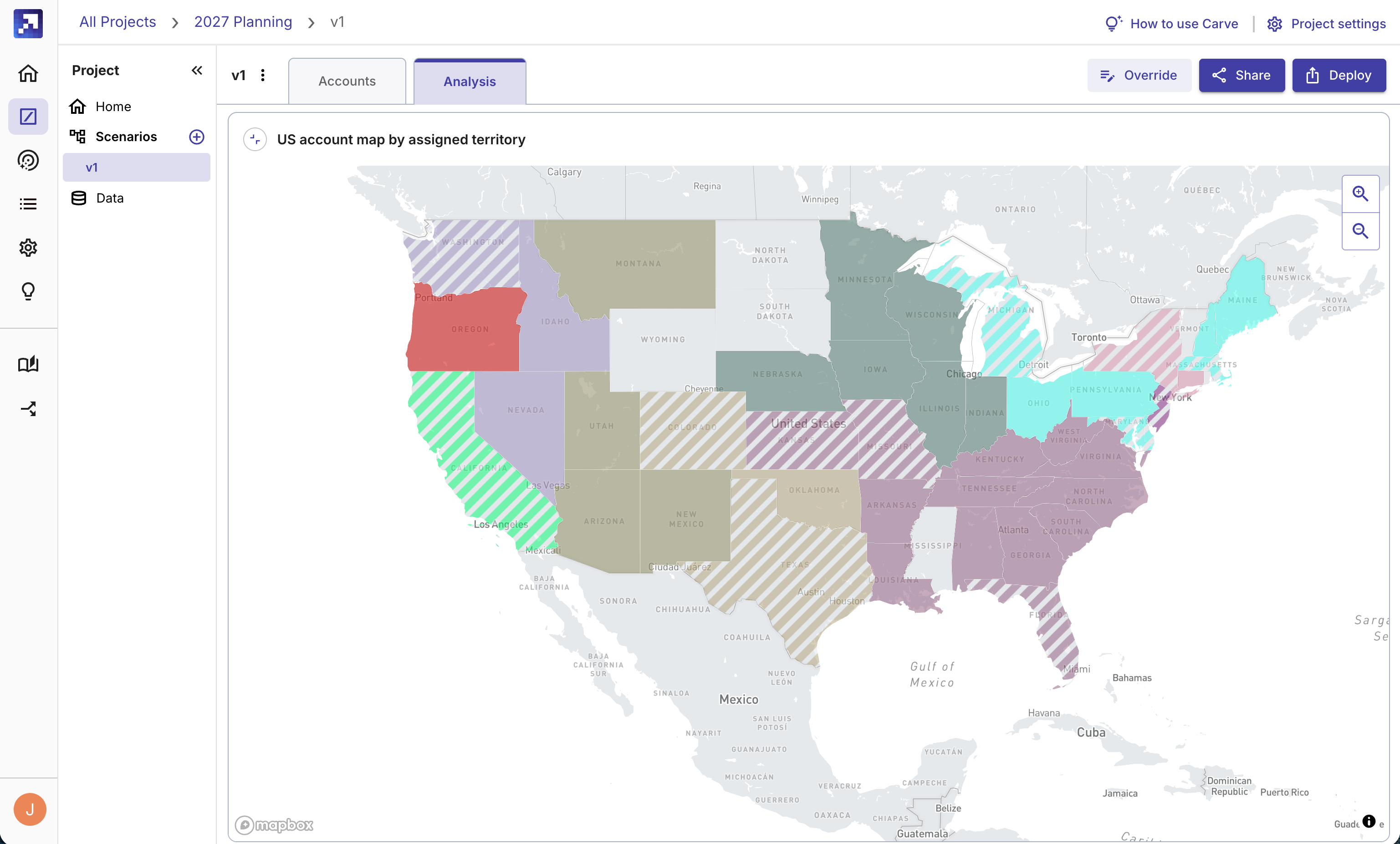
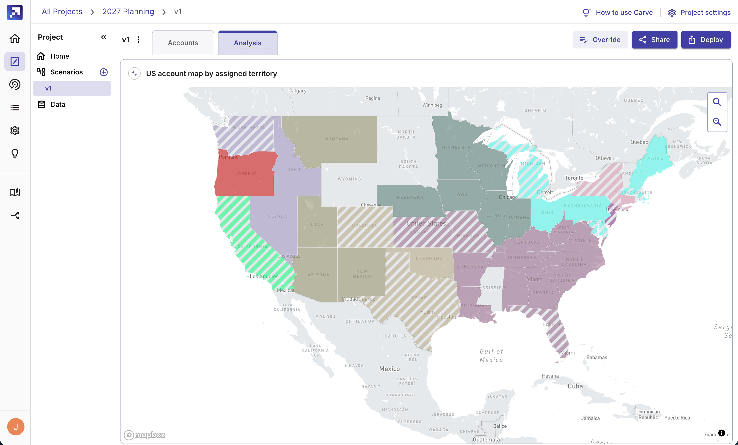
Territory planning doesn't end when the carve's done. Once you have a draft of territory assignments, you still need to understand whether the plan meets your goals, communicate it to the people it affects, and produce something visual that leadership and the sales team can actually react to.
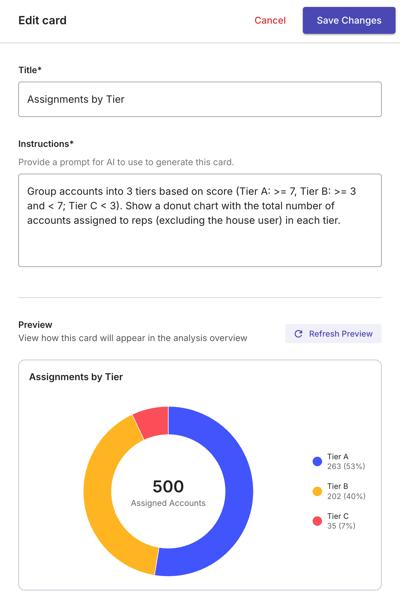
That's what the new Carve analysis dashboard is for. When you run a scenario, Carve automatically generates a full visual analysis from your results. From there, you can ask for any additional chart, map, or summary in plain language and it's ready in seconds.
Ask for anything in plain language. Get analysis of things like:
- Top 10 industries by number of accounts, stacked by rep
- Table of reps before and after the carve, showing ASV, account count, and tier
- Revenue potential by industry, sorted and filtered to the top 10
Here are 11 ways teams are using Carve
1. Presenting scenarios to leadership
Leadership wants to choose between options, not react to a single plan. With the analysis dashboard, each scenario gets its own full set of cards, so you can come to the meeting with three carved scenarios and a polished visual view of each one. Instead of defending a spreadsheet, you're walking through actual analysis.
"It's being able to come to James with options, saying, I carved the books in four different ways. What do you think is the most equitable? Option A is most equitable from a geographic location. Option B is most equitable from total white space. Option C is most equitable from the number of hierarchies." -- Kasin Bennett, Attentive
2. Selling the plan to the sales team
Territory plans that feel arbitrary don't get buy-in. Narrative cards give you AI-written explanations of why accounts were assigned where they were, so the reasoning is built into the deliverable. Share it with reps before the quarter starts so questions get answered before they become complaints.
"It's not just carving territories. It's getting the sales team excited about why you're putting them in the best position to win. I'm not spending time doing documentation because the documentation is built into the product." -- Palen Schwab, Liquibase
3. Checking whether rep books are balanced
After a carve, the first question is usually whether the distribution is fair. Metric and chart cards let you see rep-by-rep comparisons of account counts, revenue potential, segment mix, and more without building a pivot table. If something's off, you can iterate on the scenario and regenerate the analysis.
4. Understanding what changed from last quarter
A carve tells you where accounts ended up. The analysis dashboard can tell you how that compares to before: what each rep gained or lost, how coverage shifted, which segments moved. Useful for re-carves, mid-year adjustments, and any time you need to explain what changed and why.
5. Identifying coverage gaps
Geographic and segment-level cards make it easy to spot where you're under-covered or where account density doesn't match rep capacity. Instead of exporting to a mapping tool, the analysis lives in the same place as the carve.
6. Quarterly book review for AM and CSM teams
Customer-facing teams that rebalance books every quarter can use the dashboard to show reps what their book looks like at each cycle. A consistent set of cards means everyone is looking at the same view, and the layout persists so it's there when anyone needs it.
7. Building the summary you'd share with a VP
After a carve, someone has to write the summary: what was done, what the results are, what the recommended next steps are. Narrative cards generate that automatically from the scenario. Edit it if you want, or use it as-is.
8. Explaining a carve to someone who wasn't in the room
Not everyone who needs to understand the territory plan was involved in building it. The analysis dashboard gives them something concrete to look at: charts, metrics, a narrative summary, and a layout that persists so it's the same every time they open it. Coming soon: a shareable link that means they won't even need a Carve login.
9. Post-acquisition territory integration
When two sales teams merge, you need to carve a clean combined territory from a messy account base and then explain it to both teams. The analysis dashboard makes the output visible and shareable so people can see how the new structure works.
10. New headcount territory setup
When a new rep joins, the carve establishes their territory. The analysis dashboard gives them a visual view of their book from day one: who they have, what the revenue potential looks like, and how their assignment compares to the rest of the team.
11. Campaign and project account distribution
Any time someone would normally open a spreadsheet to assign accounts for a project or campaign, Carve can do the assignment and generate the analysis. The dashboard shows how accounts were distributed across the team, which segments are covered, and what the overall scope looks like.
The new analysis dashboard is available to all Carve customers now, on every Gradient Works plan including free.
Log in to try it, or sign up for free if you're not yet a customer.