



Territory planning is a numbers problem. Account counts, revenue potential, the right segment mix. Most territory conversations happen in spreadsheets and pivot tables, in rows and columns.
For years, we've preached that for many of us, territories should not be a geographic problem. That's the whole concept behind dynamic books, which is a more efficient way to distribute accounts for lots of companies.
However, we also realize some territories have a geographic component. The accounts in your plan have headquarters somewhere. And sometimes you need to see where those accounts live.
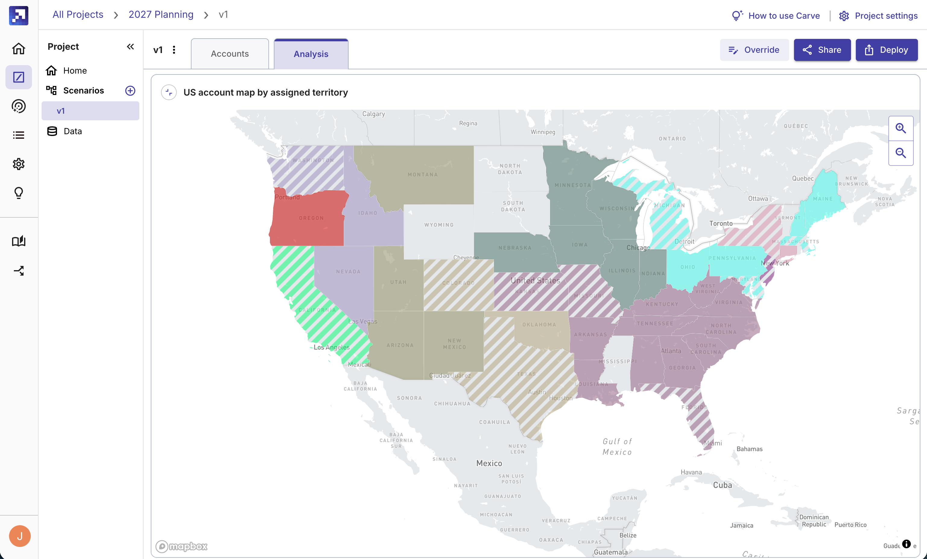
Carve now lets you visualize your territory assignments on a map.
Geographic territories in Carve
%20(1).png?width=700&height=394&name=app.gradient.works_carve_sample_f0050146-8e88-46ff-a902-5b6f49eab055_scenarios_scenario=a3d3de8f-be33-4dbc-bd7a-83d7f07d1aa1%26scenarioName=Regional%26tab=analysis(Desktop%20screenshots)%20(1).png)
When you run a scenario in Carve, you can add a map card to your analysis dashboard that shows where your accounts are assigned across the country or around the world. You can see at a glance which reps are covering which regions, where account density is highest, and where the plan might have gaps.
This is especially useful for:
- Field sales teams where physical geography directly affects who covers what
- Identifying coverage gaps where accounts are clustered but rep capacity doesn't match
- Explaining territory logic to reps and leadership who think geographically
- Post-acquisition integration where two account bases need to be merged into a clean geographic structure
Why it matters
Numbers can hide things that a map makes obvious. A rep might have a balanced book by account count but their accounts could be spread across five states, making the territory unworkable in practice. Another rep might have fewer accounts but they're all concentrated in a single metro.
A map shows you that. A spreadsheet doesn't.
Part of the larger analysis picture
Map cards are one of five card types in Carve's new analysis dashboard, along with metrics, charts, tables and AI-written narratives. You can add a map to any scenario's dashboard, arrange it alongside your other analysis, and share it with your team without exporting anything.
Log in or sign up free to try it.


.jpg)