

Market Map provides a map to help you navigate the accounts in your CRM. It helps you quickly identify and prioritize your highest potential prospects.
Let’s walk through how Market Map works. We have an interactive demo map here that you can play with and you can get a map of your own accounts for free here.
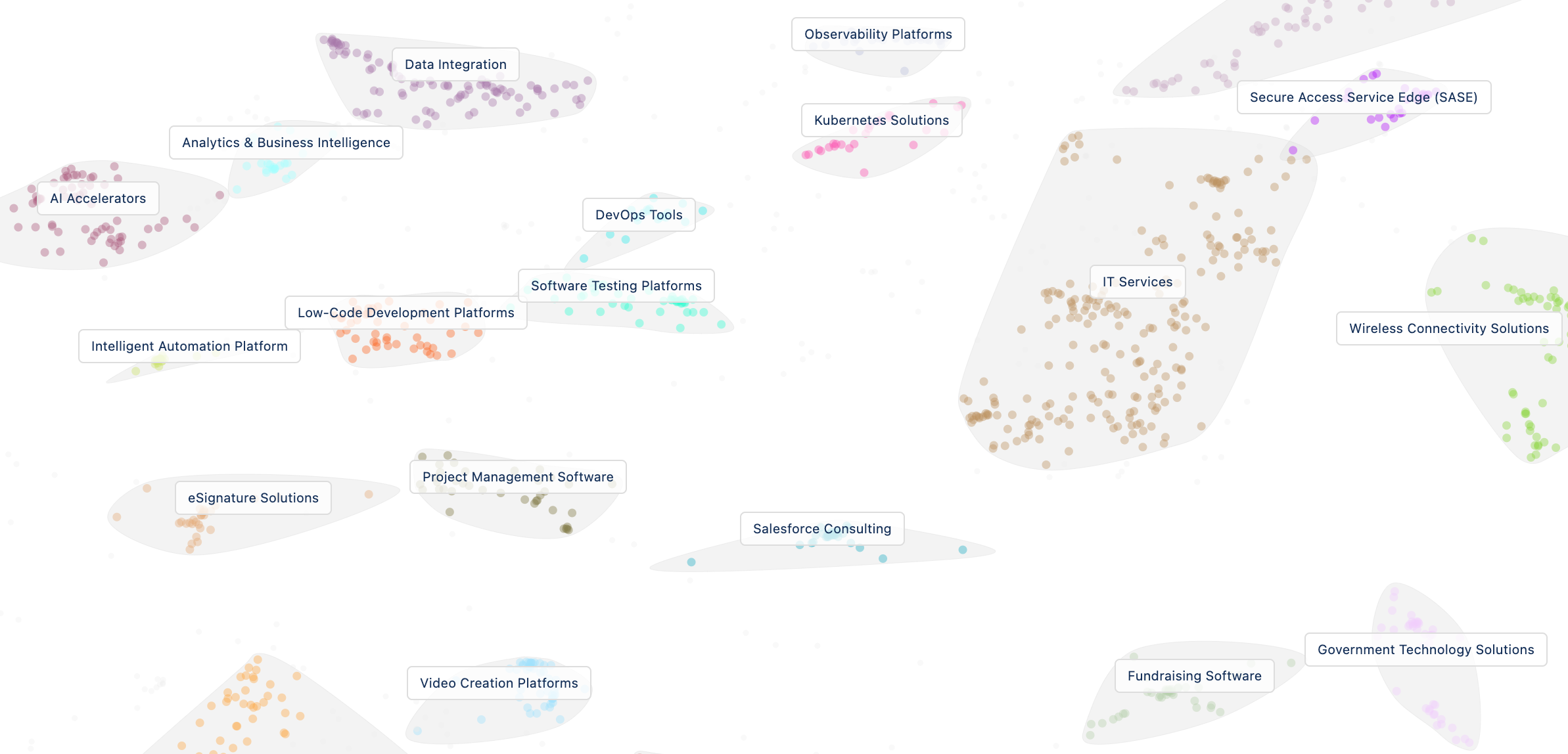
1. You start with a high-level view of all the accounts Market Map has analyzed, grouped into clusters of similar accounts.
-
Each dot represents an account. The closer together the account dots are, the more similar they are.
-
Each cluster consists of multiple companies (dots) that have been grouped together by how similar they are, based on AI analysis of how those accounts describe themselves.
-
Each cluster has a specific AI-generated label that describes what that group of accounts does, as well as a random color to help you quickly see differences between clusters.
- You can go to "Accounts" and see the panel summary of tiers, accounts, and attributes into a list view. The list is both customizable and can be filtered.
2. You can move around on the map in a variety of ways.
-
Zoom in and out of the map using the magnifying glass icons at the top or by double-clicking on the map. (It works on mobile too!)
-
Try zooming into a cluster for more detail. We like the Cybersecurity cluster in the demo Market Map.
-
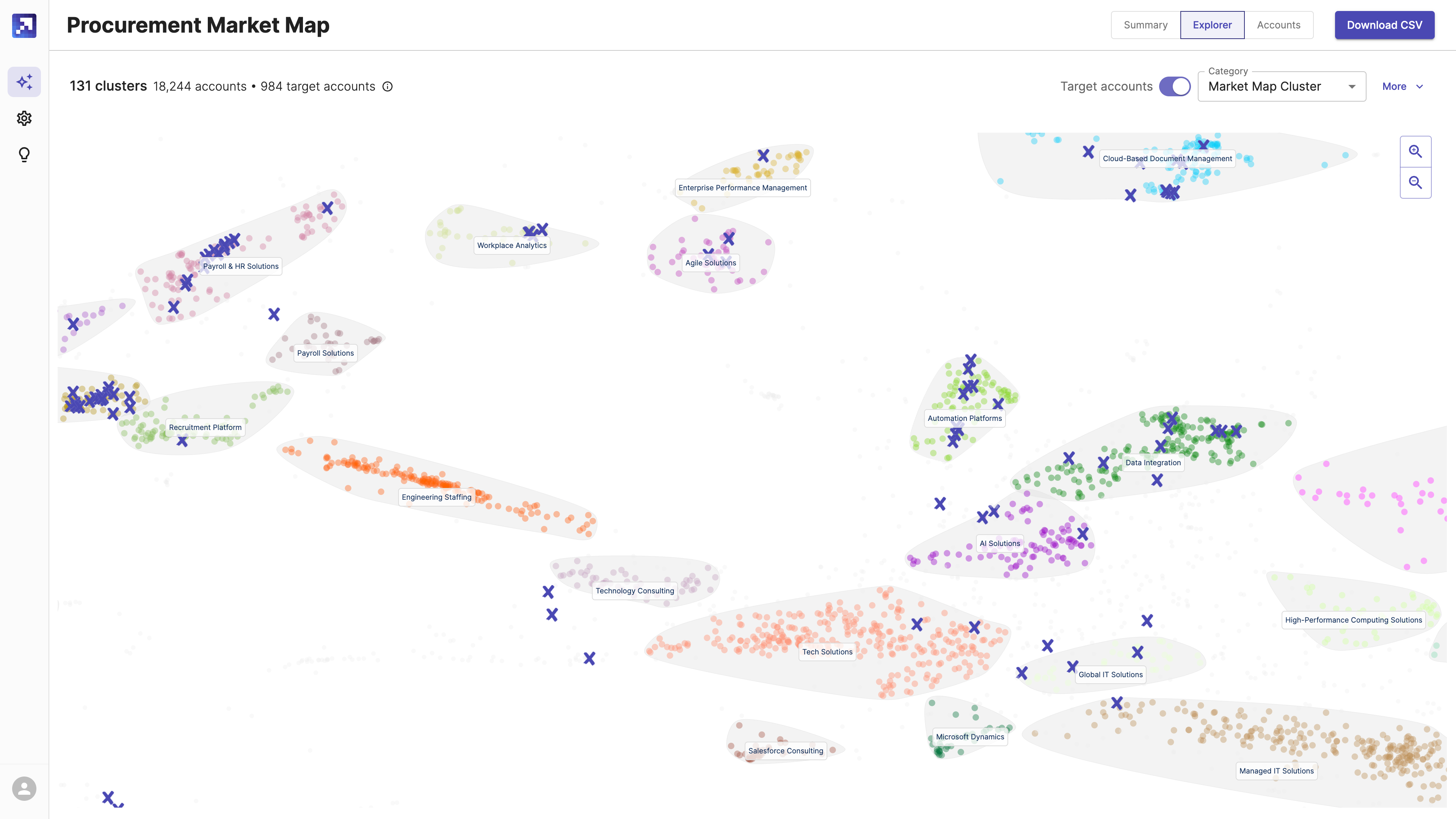
Click the cluster for more information about it, including how many total accounts we found in that cluster, as well as how many are already customers.
-
Hover over a dot to see the account name and tier (more on tiers in a second).
3. The map has a few different views.
-
You can toggle off and on customer identification (reference accounts). Turn this on to find existing customers and where they show up on clusters. X marks the spot (each X is an existing customer).
-
You can also switch to a tier view instead of the cluster view, which will color each account dot by its potential, or similarity to your existing customers. Green dots are the best match. Tier 1 and 2 accounts are very similar, high-potential prospects. Tier 5 is the worst fit. You can use this view to identify accounts for sales outreach (more on this in a second too).
- You can click "explore" or "accounts" and click on individual accounts to see panels that include their lookalike score, tier, and any attributes you selected when creating the market map.
4. Get an export of Market Map data.
-
You can export the Market Map account and customer data to Salesforce, HubSpot, and CSV so you can take action on what you find (it's not available in the interactive demo map). The export is a list of individual accounts with their cluster and score.
-
The free map export is limited to a sample of accounts, but a full map export includes data on every single account.
5. You can use Market Map to prioritize accounts for outreach.
-
Make sure a sales rep is working every single tier 1 account.
-
Identify high-fit clusters of potential that reps can target with customized messaging informed by how you work with customers in that cluster.
6. Take the next steps.
-
The interactive map is a sample set of real customer data. You can also get a free custom map on up to 5,000 accounts from your own CRM.
-
You can upgrade to a full map for market analysis of more accounts (as many as you have in your CRM if you want), as well as the full data export with details on every cluster and account, and integration with your CRM so the MM cluster and score data shows up on the account record.
-
You can also connect Market Map to Bookbuilder to manage account distributions and retrievals, activity and outcome tracking, and so much more.
Here's a short video that shows you how to use Market Map for a specific use case - identifying one of your best customers and finding great prospects just like them to target for sales outreach.